
Tag: USA

  • A Trillion Here… a Trillion there….

    A Trillion Here… a Trillion there….

    An outstanding comparative analysis of the dollar “cost” of US Wars, “then and now”.

    Apologies to [either Dirksen or Rockefeller], but certainly, once we have a trillion here, and a trillion there, “pretty soon, you’re talking real money” !

    We know these numbers are staggering.  Recently [late 2015], Bank of America Merrill Lynch [ BoAML ] produced analysis showing that:

    1. The US spends more on its defence budget than the next fifteen [15] countries combined
    2. The US Pentagon spends more than all 50 States in the US spend on health, education, welfare and safety combined
    3. The US has 5% of the world’s population but almost 50% of total global military spending

    Note: Consider the little country in the bottom right-hand corner! [Australia], punching above our weight as they say! More to come

    Global Defence Spending

    Global Defence Spending
    [Source: BoAML – Transforming World Atlas 2015]


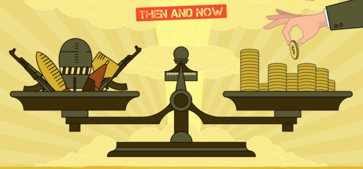
    Norwich University has produced this infographic, depicting the comparative size/percentage of military expenditure in wars fought by the United States of America.

    Though it lasted fewer than four years, World War II was the most expensive war in United States history. Adjusted for inflation to today’s dollars, the war cost over $4 trillion and in 1945, the war’s last year, defense spending comprised about 40% of GDP. During that time, the government used new methods to raise the required funds and succeeded in accomplishing its goal. While the wars waged in today’s world are significant and costly, they still pale in comparison to the size and financial impact of World War II.

    – Online Master of Arts in Military History

    Then & Now – The Cost of US Wars

    The Cost of U.S. Wars Then and Now
    [Source: Norwich University Online Master of Arts in History Program ]
    Norwich University’s Online Master of Arts in History Program

    Links

  • US Economy in 3D

    US Economy in 3D

    This 3D Map Visualizes the U.S. Economy in a New Way

    The team at howmuch.net built a map to provide a 3D visualization of the GDP growth by US metropolitan areas. The higher the cone rising out of the map, the greater the GDP growth in that area. GDP growth increased 2.3% in 2014 as compared with 1.9% growth in 2013. The industry with the highest growth was professional and business services.

    US Economy in 3D
    [Source: HowMuch.net]

    Link

  • Startup 1 – SuperPower 0

    Startup 1 – SuperPower 0

    The Secret Startup That Saved the Worst Website in America-The Atlantic

    The Atlantic’s Robinson Meyer has an excellent piece on Loren Yu, Kevin Wang, Rohan Bhobe and the Marketplace Lite team [MPL], working as a startup within the US Government to “retrieve” the first iteration of a bloated and apparently unfit-for-purpose roll-out of the Healthcare.gov online environment. This is a complimentary piece to the one WIRED published in 2014.

    Loren Yu
    [Source: The Atlantic]
    Taken together, these provide detailed insights in to the changes in project design, costing, implementation and operation of major customer-focussed online environments that “schooled”  their government patrons.

    Governments closer to home should look VERY closely at these structures. Consider the fate of such things as the Victorian Education Department ULTRANET and the Victorian Police IT Infrastructure, just to name two.

    Consider some of these “advances” from the MPL group:

    • replacing contractor-made apps with ones costing one-fiftieth of the price.
    • almost DOUBLING user completion rates from 55% to around 85%
    • reducing response times from 2-10 seconds [an eternity] to 30 milliseconds
    • The old login system cost $250 million to build and would have required another $70 million annually to stay online.
    • The new system cost about $4 million to build, and its annual maintenance cost is a little less than $1 million.

    Meyer says:

    Yet it’s hard to overstate just how dismal the website was.

    The site’s login system—the software which accepted usernames, passwords, and was used by every health insurance applicant—had a 91 percent uptime rate. Imagine if Google.com randomly stopped returning search requests for two hours, every day, and you would be imagining a more reliable website than the one that the Obama administration introduced. On Healthcare.gov’s first day, six people successfully used it to sign up for health insurance.

    The spectacular failure of Healthcare.gov at launch led to the creation of what came to be known as the Tech Surge, [and many suggested at the time, this TOO would fail ] a group of Silicon Valley developers who rescued the website from disorganized contractors and bureaucratic mismanagement. That group gave rise to the U.S. Digital Service and, to a lesser extent, 18F, two government agencies now working to improve the state of federal technology.

    You can read the full piece here.

    Links:

  • Guns vs Death

    Thanks to Mark Reid for this timely analysis.


    Death vs guns


    Links


  • Nate Silver – What’s the chance?

    Those interested in evidence-based-planning or frankly, any form of rationale decision-making, will find much to interest them in the work of Nate Silver.

    The Business Insider reports:

    With Obama being declared the winner by the networks, it looks possible that Nate Silver’s map will be perfect, all 50 states called correctly. Not certain yet, but really, an epic followup to 2008.

    Nate Silver himself is still circumspect yet his modelling shows 313 to 225 Electoral College split – [at time of publication]

    It really is worth the effort to look at his work, both in 2008 and again this year.  His recent interview on NPR and his disdain for cliche-driven pundits not willing to make “a call” when evidence suggested a high probability of an Obama win, makes for a sobering commentary on what currently passes for “informed debate”.  Regardless of the politics of the winner, the process of analysis and informed reporting is a modern jewel.

    Does this mean the earth really is round?

    US Election Map - Nate Silver


    Links:


  • Social Mobility and Education Gaps

    Four Flags

    Those in Australia interested in the debate about education, equity and long-term social mobility within societies would benefit from reviewing the latest from the Sutton Trust.

    It is interesting to place the work of the Gonksi Review in the context of this discussion.

    My thoughts on Gonski can also be found here. A very soggy Gonski [as predicted]

    Current [and somewhat favourable] comparative analysis of Australia within the four countries should also be cautiously considered within the context of the trends we are are now seeing; greater inequity, and concentration of disadvantage. This should give policy-makers and parents alike, considerable pause…

    The Social Mobility Summit found:

    Despite being similarly unequal, the four major Anglophone nations have different social mobility levels, with the UK and US significantly less mobile than Canada or Australia.

    The Sutton Trust in the U.K. [Founded by Sir Peter Lampl in 1997] held a conference recently [May] presenting the latest international research findings on social mobility, educational achievement, and other key characteristics of the four major Anglophone countries – the United Kingdom, the United States, Canada and Australia. The report was jointly sponsored by the Sutton Trust and Carnegie of New York, it is the latest in a continuing line of work investigating international comparisons of mobility.

    It is interesting to note in our current domestic debate how positively others view our educational outcomes. Of course no single comparison is definitive, or necessarily useful, but the perspective of others can often add value to such doctrinaire debates.

    Social Mobility Summit -Underachievement Comparison
    Underachievement Comparison – Social Mobility Summit 2012


    Those interested in such research would find the work of the Sutton Trust and the recent Social Mobility Summit very useful.

    Links


  • US Student Debt surpasses Credit Cards

    In the most recent quarterly report [August 2011] on Household Debt and Credit by the Federal Reserve Bank of New York it reports [amongst many other things] that for the student loans will exceed $100 billion dollars and all outstanding balances will exceed $1 trillion dollars.  Staggering numbers.

    Links:

  • Life imitating Art – US Debt ceiling

    One can’t help but wonder if the the lack of agreement between the Democratic and Republican parties over the proposed extension of the US debt ceiling is anything more than grand political theatre, although this time it appears to be a different ball-game with the growing role and influence of the “tea-party” members.

    Perhaps more telling is the role of David and Charles Koch and the political and organisational might they bring to bare on the debate in Washington. If nothing else, these guys are serious.

    If West-Wing writers are to be believed, then we will see a last minute agreement that will [probably] temporarily extend the limit. This has to make you smile…

    The larger danger is perhaps the longer-term rancour and uncertainty these events will inevitably inject in to US politics. Going so close to the wire with those that genuinely are prepared to default, will spook the market and ratings agencies. I doubt the US will default, although this time, I BELIEVE they might.  That’s all it takes for the markets to desert the ship. No doubt the ratings agencies will think long and hard about the ratings….

    The Atlantic had an interesting article in May of this year, outlining the IMF’s charting of the US Debt and the similarities to Japan a decade ago.

    japan u.s. net debt to GDP 2010.png


    This is a very new world. A generation of western nations that have spent, but not necessarily built [in the good times] will begin to demonstrate the lack of foresight that previous generations have had.

    In its simplest form here in Australia, we have had decades of tax-cuts [enough for milk-shakes and hamburgers or perhaps a new television] but when it comes to genuine national priorities like Climate ChangeBroadband networks, rail [fast or otherwise], ports, shipping, medical research, education, indigenous health etc, we seem frozen in the weakness of what will win the next election rather than bi-partisan commitments to improving the nation over the medium and long-term.

    Modern western politics is not functioning as well as it should [perhaps it is doing the best it can?] and many are missing out on the riches and benefits experienced by increasingly smaller numbers within those societies.

    The growing tail of inequity is seen most starkly in the education and health outcomes in communities across not only our own country, but many western democracies.

    Challenging times ahead.

    Update: Standard and Poors downgrades US to AA+

    Edit: August 8th

    Drew Westin writes an opinion piece in the New York Times, thinking aloud about Barack Obama’s mind-set in the Presidency – What Happened to Obama’s Passion

    Paul Krugman also comments on Westin’s piece with his own observations – “Stuck in the muddle


  • Schools that Transform

    Schools That Transform. – Andrew Leigh

    David Brooks reports on some surprisingly large impacts from a randomised trial of New York “Harlem Children’s Zone” schools. The effects are so big that I find it hard to imagine they’re readily replicable, but it’s tantalizing stuff.

    The fight against poverty produces great programs but disappointing results. You go visit an inner-city school, job-training program or community youth center and you meet incredible people doing wonderful things. Then you look at the results from the serious evaluations and you find that these inspiring places are only producing incremental gains.

    That’s why I was startled when I received an e-mail message from Roland Fryer, a meticulous Harvard economist. It included this sentence: “The attached study has changed my life as a scientist.”

    [Andrew Leigh]