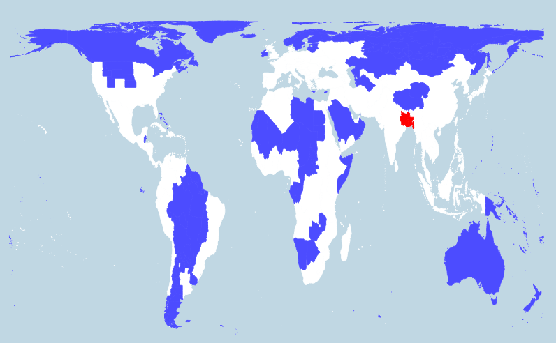
Mapping the world's immigration flows, by country-by-country. Some notes about Australia: By these estimates, Australia’s net immigration is negative with every country in the world, except for a small positive immigration balance with Sudan. Australia is the only country in the world to have significant positive net immigration with the US. Links Metrocosm.com UN - Total Migrant Stock
Tag Archives Maps
167 global temperature maps - one for every year from 1850 to 2016, in a single chart. These are Robinson projections based on the UK Met Office HadCrut4 Arctic Sea Ice A still image generated from National Snow and Ice Data Center (NSIDC) north pole sea ice extent images. These images [TP Public Data sets] are arranged in a grid pattern with…
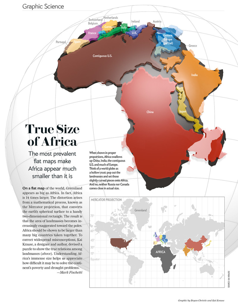
Max Galka [@galka_max] on global population densities. Just 5% of the world lives in the entire blue area. Another 5% lives in the red area. Good to see discussion of Gall-Peters v Mercator. I sit with Gall-Peters when a globe is not available!. [Am pretty sure the GTAV were one of the first to introduce this in the 80's... had one…
Well, if you live in Australia, then don't worry, you might be about 1.5 metres "off". A team from GEOSCIENCE Australia are about to recalculate the nation's latitude and longitude coordinates, which are currently out by more than 1.5 metres. Australia sits on the fastest moving continental tectonic plate in the world, thus coordinates measured in the past continue changing over…

Europe is experiencing the biggest refugee crisis since World War II. Based on data from the United Nations, the LUCIFY group clarify the scale of the crisis with a stunning piece of visualisation. Links: The flow towards Europe - Lucify Refugee Council of Australia Asylum Seekers and Refugee Guide - Australian Human Rights Commission
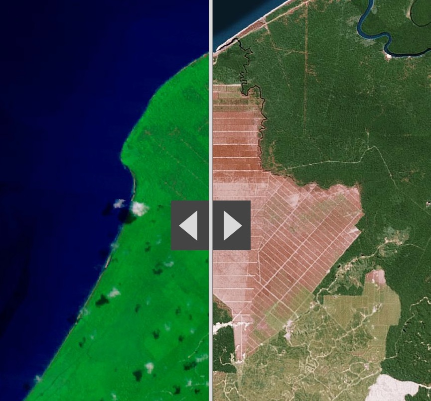
Its not a long time, twenty-five years. ESRI [ @Esri ] has produced some excellent comparative analyses of Human activities that are reshaping the Earth's surface using 1990 Landsat imagery [left] and Esri’s World Imagery basemap [right] Links LandSat Comparison - Story Map ESRI Story Maps LandSat
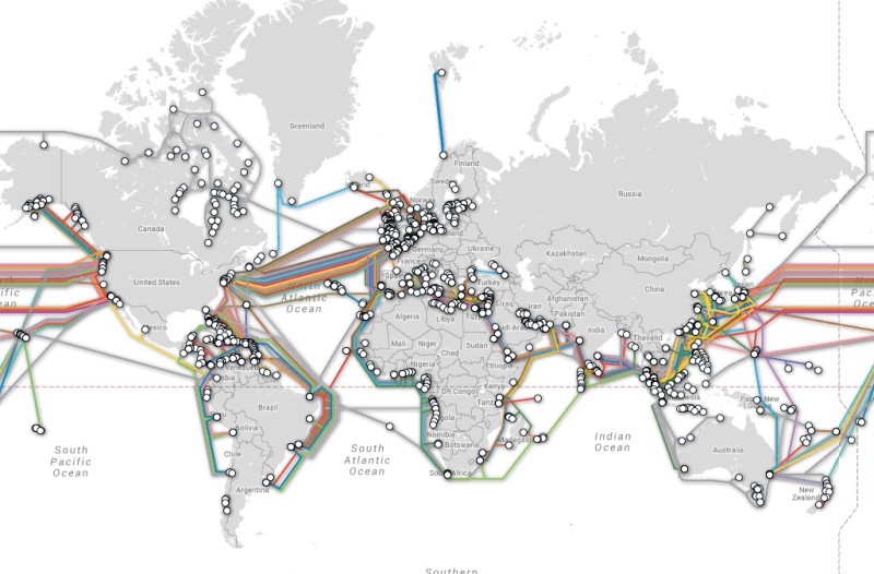
The telegeography group do some great maps. These two remind us of the very tenuous links that are in fact the basis of all of Australia's modern communication and much of its commerce. SubmarineCable.com A 'new" ancient map As much economic and perhaps cultural connections too. The VOX published a great piece earlier last month relating the modern cables to…
The UK's National Air Traffic Services offers an animated tour of just how flight paths are managed. A fascinating and beautiful visualisation. Links Nats24
12