Tag: Public Data

  • Listen to Larry

    Listen to Larry

    Early detection, early response

    Larry Brilliant 2006

    Accepting the 2006 TED Prize, Dr. Larry Brilliant talks about how smallpox was eradicated from the planet, and calls for a new global system that can identify and contain pandemics before they spread.

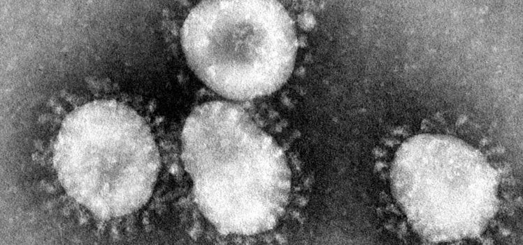
    Corona Virus

    Corona Virus
    By Photo Credit:Content Providers(s): CDC/Dr. Fred Murphy – This media comes from the Centers for Disease Control and Prevention’s Public Health Image Library (PHIL), with identification number #4814.Note: Not all PHIL images are public domain; be sure to check copyright status and credit authors and content providers., Public Domain, https://commons.wikimedia.org/w/index.php?curid=822112
  • Hans. How not to be ignorant

    Hans. How not to be ignorant

    At a time when it appears revealed truths, beliefs and opinions are increasingly privileged in public and political debate,there was always Hans…

    Vale, Hans Rosling

    [ted id=2090]

    Links


  • What an inner-circle really looks like!

    What an inner-circle really looks like!

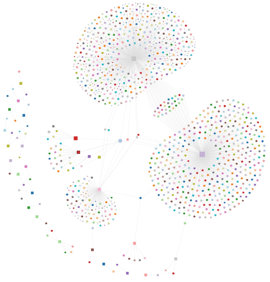
    The MIT Media Lab Macro Connections group, has done some stella work on visualising network associations over their time. You should visit the Global Language Network or the Human Development Index Tree [2010] They build tools to transform data into stories.

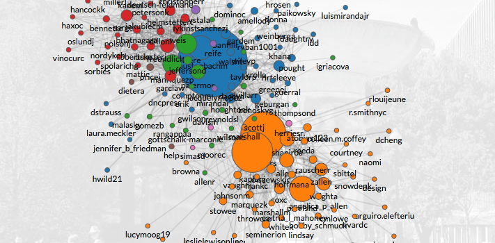
    The Clinton Circle, maps emails from Hillary Clinton, John Podesta and the DNC in the United States.. Certainly topical!

    The data is entirely sourced from WikiLeaks, and was last updated on Sun Oct 30, 2016.

    People-centric view of email

    ClintonCircle was not created to visualize these emails, but it is a fork of a tool called Immersion that they launched in 2013 that helps people visualize and understand the networks they weave through email interactions. They say:

    Immersion is an invitation to dive into the history of your email life in a platform that offers you the safety of knowing that you can always delete your data.

    Hilary Clinton Email Circle
    [Source: Hillary Clinton MIT Macro Connections]
     

    Macro-Connections study collective learning at  by looking at the evolution of what people make, and by making tools to improve how they communicate.

    Seems like a class I would have loved!

    Links

  • Yes, warmer still…

    Global Warming
    [ Source: wired.com ]
     

    167 global temperature maps – one for every year from 1850 to 2016, in a single chart.

    These are Robinson projections based on the UK Met Office HadCrut4

    Arctic Sea Ice

    A still image generated from National Snow and Ice Data Center (NSIDC) north pole sea ice extent images. These images  [TP Public Data sets] are arranged in a grid pattern with the years across the top from 1979 to 2014 and the months running down the image from January to December.

    Arctic Sea Ice
    [Source: NASA]
     

    Links

  • Cape Grim

    Cape Grim

    …both metaphorically and now, perhaps literally.

    The Age reports on the CSIRO findings:

    Within the next couple of weeks, a remote part of north-western Tasmania is likely to grab headlines around the world as a major climate change marker is passed.

    The aptly named Cape Grim monitoring site jointly run by CSIRO and the Bureau of Meteorology will witness the first baseline reading of 400 parts per million (ppm) of carbon dioxide in the atmosphere, researchers predict.

    Hardly news, considering this [2006], this [2009], this [2012], this [2013] this & this [2015], this [2016], just to name a few. Oh!  let’s not forget my vote for the understatement of the epoch:

    …there’s a lot riding on how the Earth spins…

    the earth’s axis…

    Interest

    Considering the existential nature of the public policy challenge, it most certainly appears Australian interest [as gauged by Google search trends – yes, hardly scientific] suggests at least one of the trends being graphed is certainly “going south”.

    Leadership anyone?  Bueller?  Bueller?

    Google Search


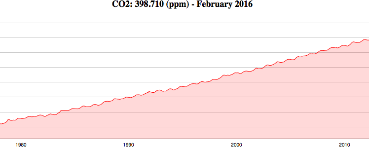
    The most recent reading on May 6 was 399.9 ppm, according to readings compiled by the CSIRO team led by Paul Krummel that strip out influences from land, including cities such as Melbourne to the north. (See chart below, with the red line showing the baseline CO2.)

    Capegrim-Co2
    [Source: The Age | CSIRO | BoM ]
     

    Historical Trends

    Carbon dioxide concentrations in the air were reasonably stable (typically quoted as 278 ppm) before industrialisation (in the timeframe of human existence).

    Since industrialisation (typically measured from the mid-18th century), carbon dioxide concentrations have increased by about 40 per cent, based on measurements from Cape Grim and on air samples collected from Antarctic ice at Law Dome. [ Source: CSIRO ]

    Cape Grim Historical Trends
    [CO2 Historical Trends – CSIRO]
     

    Links


  • Hot, Hotter, Hottest… again

    Hot, Hotter, Hottest… again

    Some thoughts for the new year…

    The. Hottest. Twelve. Months. EVER…


    2015 was the hottest year on record globally.

    Climate change was a major factor in driving the record-breaking heat in 2015 worldwide.

    • The global average temperature for 2015 was 0.90°C above the 20th century average, eclipsing the previous record set in 2014 by 0.16°C.
    • The record global warmth of 2015 is part of a long-term trend. All of the world’s 10 warmest years have occurred since 1998. 2015 is the 39th consecutive year with above-average global temperatures.
    • No one aged under 40 has lived in a year with global average temperatures at or below the global 20th century average.


  • Water Scroller

    Katie Park, the graphics editor at The Washington Post recently published an elegant data visualisation of the impact of the Californian drought on water storage levels.

    California is in the fourth year of its most severe drought on record, facing low precipitation, dwindling mountain snowpack levels and the hottest temperatures in state history. The water supply in the state’s reservoirs has dropped to historic lows, especially in the central part of the state.

    The Water Scroller

    The Water Scroller

    Links

  • Project Tycho

    Project Tycho

    Project Tycho® is a project at the University of Pittsburgh to advance the availability and use of public health data for science and policy making. Currently, the Project Tycho® database includes data from all weekly notifiable disease reports for the United States dating back to 1888. These data are freely available to anybody interested. Additional U.S. and international data will be released twice yearly.

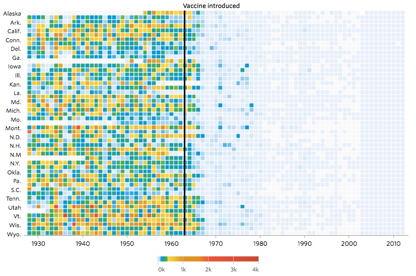
    The Wall Street Journal [specifically Tynan DeBold @tynandebold  and Dov Friedman @dov_friedman] recently published an outstanding article on Project Tyco, highlighting the Infectious Diseases data sets and the impacts of vaccination on populations over time.

    This was winner of GEN Data Visualisation of the Year 2015. This project documents the impact vaccines had on 7 infectious diseases.

    Look closely.

    Measles

    Impact of Vaccines
    [Source: Project Tycho & Wall Street Journal]

    Hepatitis A

    Impact of Vaccines
    [Source: Project Tycho & Wall Street Journal]

    Links

  • Does Money Win?

    Does Money Win?

    Simply Outstanding Work.

    http://au.politicaldonations.info

    Australian donations to political parties visualised.

    Look closely at the starting state of the visualisation. Do they look like lungs to you?

    Australian Political Donations
    [Source: http://au.politicaldonations.info ]
    Of course, the phrase “tip-of-the-iceberg” comes to mind.

    The Political Donations visualisation website takes publically available data from the AEC and presents it in a graphical view to make visual analysis of the donations to all political parties in Australia easier and more intuitive.

    The data is presented as a force directed layout showing both links and magnitudes of donations to all major parties. The data can be filtered and detailed information is available by clicking on any node in the layout.

    Links