If you have never pondered the nature of exponential change/growth in knowledge, consider this.
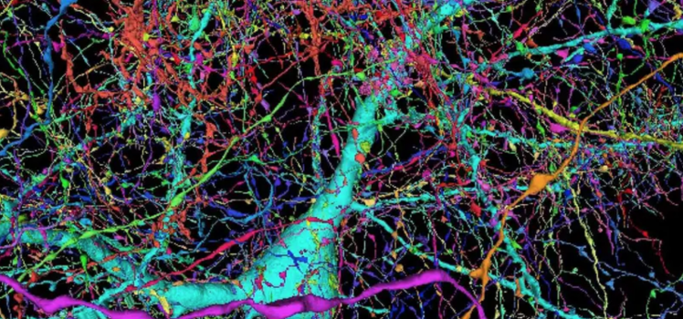
The human brain is one of the most complex structures in existence. Google, in collaboration with Harvard University, have released a browsable 1.4-petabyte reconstruction of a very small part of the human cortex.
This is every cell and connection in a cubic millimeter of the human brain.
Petabyte connectomic reconstruction of a volume of human neocortex. Left: Small subvolume of the dataset. Right: A subgraph of 5000 neurons and excitatory (green) and inhibitory (red) connections in the dataset. The full graph (connectome) would be far too dense to visualize.
The volume spans all six cortical layers.
The map includes 50,000 cells, all rendered in three dimensions. They are joined together by hundreds of millions of spidery tendrils, forming 130 million connections called synapses. The data set measures 1.4 petabytes, roughly 700 times the storage capacity of an average modern computer.
“A whole mouse brain is only 1000 times bigger than this, an exabyte instead of a petabyte,” says Lichtman. “It’s on a scale where we probably will be able to do that within a decade, I suspect.”
What is the Human Cortex? The cerebral cortex is the thin surface layer of the brain found in vertebrate animals that has evolved most recently, showing the greatest variation in size among different mammals (it is especially large in humans). Each part of the cerebral cortex is six layered (e.g., L2), with different kinds of nerve cells (e.g., spiny stellate) in each layer. The cerebral cortex plays a crucial role in most higher level cognitive functions, such as thinking, memory, planning, perception, language, and attention. Although there has been some progress in understanding the macroscopic organization of this very complicated tissue, its organization at the level of individual nerve cells and their interconnecting synapses is largely unknown.
According to Google, it’s the largest brain map at this level of detail to date, and it’s freely available to scientists (and anyone) online. The link is here.
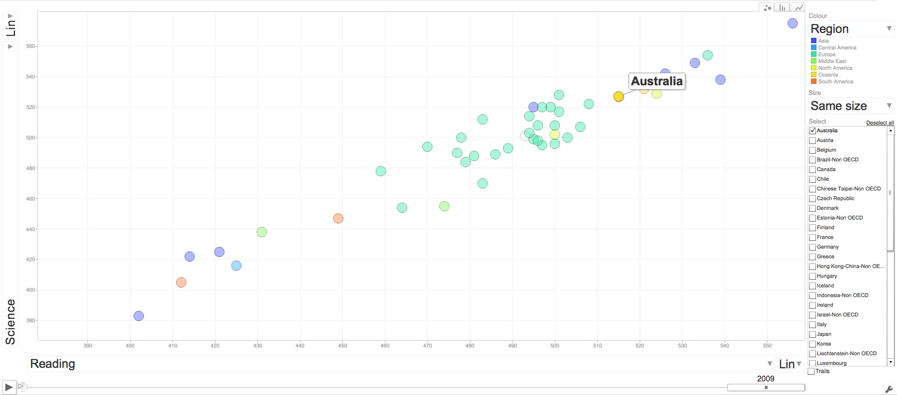
Mapping the world’s immigration flows, by country-by-country.
Some notes about Australia:
By these estimates, Australia’s net immigration is negative with every country in the world, except for a small positive immigration balance with Sudan.
Australia is the only country in the world to have significant positive net immigration with the US.
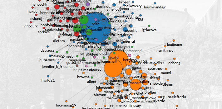
The Clinton Circle, maps emails from Hillary Clinton, John Podesta and the DNC in the United States.. Certainly topical!
The data is entirely sourced from WikiLeaks, and was last updated on Sun Oct 30, 2016.
People-centric view of email
ClintonCircle was not created to visualize these emails, but it is a fork of a tool called Immersion that they launched in 2013 that helps people visualize and understand the networks they weave through email interactions. They say:
Immersion is an invitation to dive into the history of your email life in a platform that offers you the safety of knowing that you can always delete your data.
[Source: Hillary Clinton MIT Macro Connections]
Macro-Connections study collective learning at @MIT@medialab by looking at the evolution of what people make, and by making tools to improve how they communicate.
A still image generated from National Snow and Ice Data Center (NSIDC) north pole sea ice extent images. These images [TP Public Data sets] are arranged in a grid pattern with the years across the top from 1979 to 2014 and the months running down the image from January to December.
[Source: NASA]
Links
Wired.com – Article – HOW QUICKLY CLIMATE CHANGE IS ACCELERATING, IN 167 MAPS
I recently [briefly] participated in a planning session and debate [through my WhaleSongServices consultancy business ] with an ex-colleague and some of his senior/executive staff regarding particular public policy challenges for a Government Department in the near to medium term [5-10 years] and the broader strategic needs of their planning.
We [again briefly] touched on the concept within public debate of “balance” and “both sides” of the story. False equivalence, is in my view, the scourge of public discourse, but it sure sells papers/improves ratings. The rise, of what Barry Jones called many years ago, “managerialism” in public policy, further deadens policy progress in to ‘binary’ decisions that create philosophical and programmatic “trench-warfare”. We find many who wish to find “balance” where there is none, or perhaps are happy with simply being in the trench…
This most certainly does nothing for those in need of sound and strategic public policy [ all of us ].
This exchange made me reflect that if there was only one word a teacher could use in any classroom, if there was only one word I could teach any student or my own children, it would be consilience.
Agreement between the approaches to a topic of different academic subjects, especially science and the humanities.
In other words, multiple, independent, verifiable converging views.
Consider the National Review. The editors describe the National Review as “America’s most widely read and influential magazine and web site for conservative news, commentary, and opinion”
In December 2015, The US National review highlighted [at best] their own flawed methodologies or [at worst] an intentional, untruthful re-adjustment of selective data to support a pre-defined position when they posted on twitter a seemingly straightforward contribution about Climate Change. They said:
The same graph with the Y-axis corrected for scale from Scripps.
[Source: NOAA ]
But what about the Y-Axis?
Yes, anyone that has been through a high-school class of statistics, will probably remember the “Lies, damn lies and statistics” approach that many [most?] teachers seem to take. Right at the top of the “hit-list” is the suspicion drummed into students when someone presents a chart that has a “compressed” Y-Axis. This is, in many circumstances, a valid cause for review, certainly suspicion, if the publisher is unaware that the axis has been compressed.
Sometimes, starting the Y-axis at zero is the BEST way to lie with statistics
Vox.com journalists were so fed-up with the ‘blow-back’ they received whenever they posted a chart with a compressed y-axis, they responded in the way they know best.
Consilience
…but wait, there’s more..
Perhaps the National Review should consider a reconstructed graph going back 2000 years? Proxy measurements can be used to reconstruct the temperature record before the historical period.
From these, proxy temperature reconstructions of the last 2000 years have been performed for the northern hemisphere, and over shorter time scales for the southern hemisphere and tropics [Source: Wikipedia]
Brooke Gladstone [ @OTMBrooke ] and Bob Garfield [ @Bobosphere ] from the ever-valuable and always erudite On-the-media from WNYC in the United States made two excellent contributions to the debate about false equivalence and media reporting in their pieces:
Vision of Humanity is a strong proponent of the need to further study, advocate and act on peace. It groups together a number of interrelated initiatives focused on global peace which enjoy the support of a wide range of philanthropists, business people, politicians, religious leaders and intellectuals. It brings a strategic approach to raising the world’s attention and awareness around the importance of peace to humanity’s survival in the 21st century.
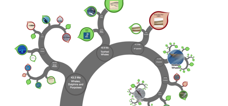
Think about this for a moment. Fractal-based mind-map that can contain and visualise all human knowledge.
The OneZoom software uses fractals to condense the entire tree of life into a single, zoomable page. OneZoom® is so named because all the information is on a single page: all you have to do is zoom to reveal details.
Not a bad start…
“Big data” is a growing issue in Science and Industry. Modern computing has enabled large amounts of data to be captured and stored and has revolutionised many branches of science. These advances, however, lead to challenges, such as how to explore and visualise large data sets. The very first blue-skies idea that could have been identified with OneZoom was that of a mind map so vast that it could contain all human knowledge.
You can now sponsor a leaf on the tree for yourself or as a unique gift. Your donations will help the OneZoom charity provide easy access to scientific knowledge about biodiversity and evolution. OneZoom is a registered charity in the UK. Their aim to provide easy access to scientific knowledge about biodiversity and evolution, and raise awareness about the variety of life on earth together with the need to conserve it.