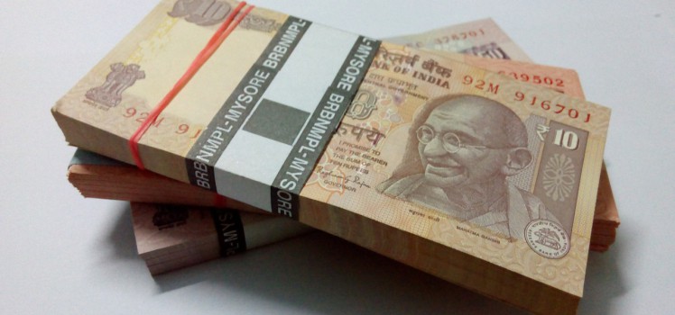
An outstanding comparative analysis of the dollar "cost" of US Wars, "then and now". Apologies to [either Dirksen or Rockefeller], but certainly, once we have a trillion here, and a trillion there, "pretty soon, you're talking real money" ! We know these numbers are staggering. Recently [late 2015], Bank of America Merrill Lynch [ BoAML ] produced analysis showing that: The…
Tag Archives Data Visualisation
The team at HowMuch.net continue their excellent work. The full article can be found here. The Global Finance Magazine recently released an article comparing countries by income across the world for 2015, sourcing data from the World Bank. Gross National Income (GNI) per capita is the final income earned by a country’s residents divided by the total population. Countries are…
The Information is Beautiful Awards for 2015, sponsored by Kantar really do highlight the exceptional [and beautiful] work available. Looks like I am not a bad judge either! Links Information is Beautiful 2015 Kantar
This 3D Map Visualizes the U.S. Economy in a New Way The team at howmuch.net built a map to provide a 3D visualization of the GDP growth by US metropolitan areas. The higher the cone rising out of the map, the greater the GDP growth in that area. GDP growth increased 2.3% in 2014 as compared with 1.9% growth in 2013. The industry with…
Katie Park, the graphics editor at The Washington Post recently published an elegant data visualisation of the impact of the Californian drought on water storage levels. California is in the fourth year of its most severe drought on record, facing low precipitation, dwindling mountain snowpack levels and the hottest temperatures in state history. The water supply in the state’s reservoirs has…
Europe is experiencing the biggest refugee crisis since World War II. Based on data from the United Nations, the LUCIFY group clarify the scale of the crisis with a stunning piece of visualisation. Links: The flow towards Europe - Lucify Refugee Council of Australia Asylum Seekers and Refugee Guide - Australian Human Rights Commission
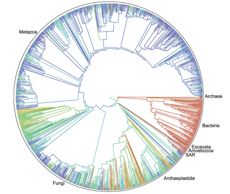
Duke University [in the US] has announced that a first draft of the “tree of life” for the roughly 2.3 million named species of animals, plants, fungi and microbes -- from platypuses to puffballs -- has been released. A collaborative effort among eleven institutions, the tree depicts the relationships among living things as they diverged from one another over time,…
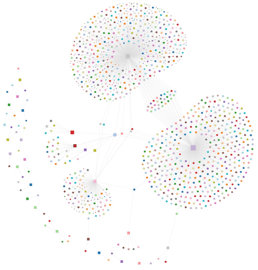
Simply Outstanding Work. http://au.politicaldonations.info Australian donations to political parties visualised. Look closely at the starting state of the visualisation. Do they look like lungs to you? Of course, the phrase "tip-of-the-iceberg" comes to mind. The Political Donations visualisation website takes publically available data from the AEC and presents it in a graphical view to make visual analysis of the donations…
GDELT is the largest, most comprehensive, and highest resolution open database of human society ever created. Yes, REALLY Big! GDELT is 100 percent free, with the entire dataset available for immediate download and a set of tools available to work with it. Creating a platform that monitors the world's news media from nearly every corner of every country in print, broadcast,…


