
Tag: evidence

  • Consilience

    Consilience

    Consilience.

    The word of the day, Year, Decade or Epoch?

    I recently [briefly] participated in a planning session and debate [through my WhaleSongServices consultancy business ] with an ex-colleague and some of his senior/executive staff regarding particular public policy challenges for a Government Department in the near to medium term [5-10 years] and the broader strategic needs of their planning.

    We [again briefly] touched on the concept within public debate of “balance” and “both sides” of the story. False equivalence, is in my view, the scourge of public discourse, but it sure sells papers/improves ratings. The rise, of what Barry Jones called many years ago, “managerialism” in public policy, further deadens policy progress in to ‘binary’ decisions that create philosophical and programmatic “trench-warfare”. We find many who wish to find “balance” where there is none, or perhaps are happy with simply being in the trench…

    This most certainly does nothing for those in need of sound and strategic public policy [ all of us ].

    This exchange made me reflect that if there was only one word a teacher could use in any classroom, if there was only one word I could teach any student or my own children, it would be consilience.

    Agreement between the approaches to a topic of different academic subjects, especially science and the humanities.

    In other words, multiple, independent, verifiable converging views.

    Consider the National Review. The editors describe the National Review as “America’s most widely read and influential magazine and web site for conservative news, commentary, and opinion”

    In December  2015, The US National review highlighted [at best] their own flawed methodologies or [at worst] an intentional, untruthful re-adjustment of selective data to support a pre-defined position when they posted on twitter a seemingly straightforward contribution about Climate Change. They said:

    The only #climatechange chart you need to see.

    Note the use of the adjective ONLY!

    They then posted this chart.

    Misleading uses of data
    [ Source: National Review ]

    The same graph with the Y-axis corrected for scale from Scripps.

    NOAA Global Temperatures
    [Source: NOAA ]

    But what about the Y-Axis?

    Yes, anyone that has been through a high-school class of statistics, will probably remember the “Lies, damn lies and statistics” approach that many [most?] teachers seem to take. Right at the top of the “hit-list” is the suspicion drummed into students when someone presents a chart that has a “compressed” Y-Axis. This is, in many circumstances, a valid cause for review, certainly suspicion, if the publisher is unaware that the axis has been compressed.

    As Corey Doctorow pointed out in the BoingBoing article that prompted this piece:

    Sometimes, starting the Y-axis at zero is the BEST way to lie with statistics


    Vox.com journalists were so fed-up with the ‘blow-back’ they received whenever they posted a chart with a compressed y-axis, they responded in the way they know best.


    Consilience

    …but wait, there’s more..

    Perhaps the National Review should consider a reconstructed graph going back 2000 years? Proxy measurements can be used to reconstruct the temperature record before the historical period.

    Quantities such as tree-ring widths, coral growth, isotope variations in ice cores, ocean and lake sediments, cave deposits, fossilsice coresborehole temperatures, and glacier length records are correlated with climatic fluctuations [Consilience anyone??].

    From these, proxy temperature reconstructions of the last 2000 years have been performed for the northern hemisphere, and over shorter time scales for the southern hemisphere and tropics [Source: Wikipedia]

    Reconstructed Temperatures
    [Source IPCC, NAP ]

    Nasa Goddard Space Centre and US National Oceanic and Atmospheric Administration [NOAA] and UK MET Office and Australia’s CSIRO, not to mention the Intergovernmental Panel on Climate Change – all come to the major public policy challenge of our time and converge with a consensus with significant confidence, yet for many, this can be dismissed by simply drawing a graph with a Y-Axis a zero?

    Brooke Gladstone [ @OTMBrooke ] and Bob Garfield [ @Bobosphere ] from the ever-valuable and always erudite On-the-media from WNYC in the United States made two excellent contributions to the debate about false equivalence and media reporting in their pieces:

    and

    Balance – a final word

    Consider these three simple terms, Evolution, Creationism, Intelligent Design and what an NGram search reveals.

    This is a search that charts frequencies of any search strings using a yearly count of n-grams found in sources printed between 1500 and 2008.


    Links

  • Settled

    Evidence

    Is absence of evidence, evidence of absence?

    Settled
    Settled
  • Renaissance 0 – Middle Ages 1

    Renaissance 0 – Middle Ages 1

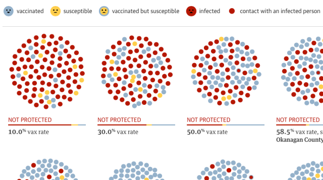
    The vaccination “debate” continues/exists. I checked, it is February 2015. This is the 21st century [by most calendars]

    Another outstanding contribution to the public-health policy debate [sadly] by the Guardian US interactive team of  and 

    The Guardian - Vaccination Simulations
    [Source – The Guardian]
     Reason and the public good appear less a component of modern society than I was aware.

    In response to those that wish to open a “debate” regarding vaccination, I am reminded of the words of one of the 20th century’s greatest philosophers, Lisa Simpson..

    Homer: “Aah, not a bear in sight. The bear patrol must be working like a charm.”

    Lisa: ‘That’s specious reasoning, Dad.”

    Homer: Thank you, honey.”

    Lisa: By your logic, I could claim that this rock keeps tigers away.”

    Homer: Well, how does it work?”

    Lisa: It doesn’t work. It;s just a stupid rock. But I don’t see any tigers around here. Do you?”

    Homer…hmm Lisa, I want to buy your rock!”

    Links:


  • Out, Liar

    Out, Liar
    Out, Liar – by Ben Shabad
  • ..believe just because it is beautiful?

    Science at its best.

    Stanford Professor Andrei Linde [known as the father of inflation] is given the news that his life’s-work appears to be confirmed by the BICEP2 experiment based at the south-pole and his first reaction is.. “if it is true……”  “do I believe just because it is beautiful?”


    Links


  • Actually…..

    I hear this a lot, actually…

    Actually
    Source: xkcd

    The Alliance for Useful Evidence champions the use of evidence in social policy and practice.  They are an open–access network of more than 1,700 individuals from across government, universities, charities, business and local authorities in the UK and internationally.

    Link:


  • Nate Silver – What’s the chance?

    Those interested in evidence-based-planning or frankly, any form of rationale decision-making, will find much to interest them in the work of Nate Silver.

    The Business Insider reports:

    With Obama being declared the winner by the networks, it looks possible that Nate Silver’s map will be perfect, all 50 states called correctly. Not certain yet, but really, an epic followup to 2008.

    Nate Silver himself is still circumspect yet his modelling shows 313 to 225 Electoral College split – [at time of publication]

    It really is worth the effort to look at his work, both in 2008 and again this year.  His recent interview on NPR and his disdain for cliche-driven pundits not willing to make “a call” when evidence suggested a high probability of an Obama win, makes for a sobering commentary on what currently passes for “informed debate”.  Regardless of the politics of the winner, the process of analysis and informed reporting is a modern jewel.

    Does this mean the earth really is round?

    US Election Map - Nate Silver


    Links:


  • Evidence-based Planning – Are we serious?

    Are we using data effectively to address inequity in our communities?

    Data
    What's Happening?

    Do we really know what is going on?

    Are we able to make confident projections?

    I think not.

    This is from a piece I wrote back in 2008 [on a website that is no longer available] and yet I feel the same question is as relevant today as it was almost five years ago. Many have made similar observations over the years.

    It is not easy, I grant this, but the challenge is to START and see what happens.

    Visualizing complex data [or simple data, for that matter]  across time, can help uncover insights and patterns that would be difficult to discover using traditional two dimensional charts. It is also a very powerful way to share insights with non-specialist stakeholders and the wider general community.

    The North Central Local Learning and Employment Network Inc. [NCLLEN] has begun an experiment for the benefit of their members, stakeholders and the young people they are charged with serving by making a series of International, State and Local level data available in a more accessible [and I would argue] vastly more strategic manner.

    They are taking a leading role in beginning to use data to have an evidence-based discussion with the people that matter most, the community, their stakeholders and government.

    The basic premise is that it makes it easier to notice an important trend when data is visualised and allows those that care most about the impact of those trends to compare and contrast what is happening in their OWN communities with communities around them and around the State. This then allows them to respond in a time-frame that is meaningful.

    This is the essence of place-based, evidence-led planning. This can be a fundamental reform to traditional methods of public-service delivery.

    The chart below is just one of a number of tools the NCLLEN have launched to focus planning discussions on the outcomes of young-people in their region.

    Their “data-dashboard” can be found at:

    www.ncllen.org.au/data

    Year 12 Attainment

    The technology platforms available to us are developing as rapidly as we need them to, meaning that there is plenty of opportunity to use existing data and existing technology, but there is only patchy evidence to suggest that traditional planning and service delivery frameworks used by governments are taking real advantage of these developments.

    iPhoneI imagine if we really wanted to track student outcomes, or access to affordable housing or any other of the myriad social policy challenges our communities face, we could employ existing data sets and technology in far more efficient, useful and insightful ways than we currently do.

    Why don’t we know, in real-time, the students that are disengaged from school ?

    Why can’t we see real-time maps of public housing and accommodation availability, rents and conditions?

    It still amazes me that we have such lag-times in many key social policy areas when it comes to the political and budgetary processes. Often the time between identifying a budget priority and deploying meaningful services is measured in months, if not years.

    Certainly any evaluation of programmes is often measured in years, well beyond the ability to provide meaningful feedback to operational staff, let alone the recipients of the policy, yet Facebook, Google or VISA are able to deploy metrics and measurement tools that are able to segment activity of customers and clients in to minutes/hours/days and use this intelligence to configure marketing and product development that is profoundly personal, when compared to the “mass-market” model.

    The developments by Wolfram Alpha back in 2009 are just another example of what is occuring on a global scale. Wolfram Alpha took a first step in an ambitious, long-term project to make all systematic knowledge immediately computable by anyone.

    You enter your question or calculation, and Wolfram Alpha uses its built-in algorithms and growing collection of data to compute the answer. Based on a new kind of knowledge-based computing…….

    The work by GoogleMaps, the OECD and others are obvious examples of how making sense of immense amounts of data are now easier than ever before.

    The Global Project on “Measuring the Progress of Societies“- hosted by the OECD and run in collaboration with other international and regional partners seeks to become the world wide reference point for those who wish to measure, and assess the progress of their societies.

    We should be able to do something similar on a local scale !

    Collecting and disseminationg real-time information, creating new knowledge with new partnerships generates wisdom that can be applied to improve community outcomes.

    Inform – Empower – Connect – Advance

  • First, Find out What Works

    This is re-produced from Andrew Leigh’s WebSite.

    Among the most interesting debates in economics today is the dispute between Jeffrey Sachs and William Easterly over how best to help the world’s poor. The discussion is interesting not only because it concerns the most important question in all of economics, but also because Sachs and Easterly happen to be exceptionally good communicators. And like the longtime Mets-Yankees rivalry, both happen to be at New York universities: Sachs at Columbia University, and Easterly at New York University.

    At stake is the question of whether development economics requires a Big Push or piecemeal reform. In The End of Poverty: Economic Possibilities for Our Time, Sachs argues that the world’s least developed countries are caught in a poverty trap, and that success requires a doubling of foreign aid. In The White Man’s Burden: Why the West’s Efforts to Aid the Rest Have Done So Much Ill and So Little Good, Easterly contends that much foreign aid has been wasted, and that it would be better to focus on taking modest, deliverable steps to make poor people’s lives better.

    Whoever is right (my own view is that the truth lies somewhere between the two), the Sachs-Easterly debate has helped to galvanise a revolution in development economics. Integral to the development economics revolution has been the advent of rigorous randomised trials to find out what works. Long regarded as the ‘gold standard’ in medicine, a spate of randomised trials are taking place across the developing world.

    In Kenya, researchers have shown that deworming drugs dramatically reduce school absences, while worm-prevention education programs had no impact whatsoever. In the Philippines, savings incentives have been shown to boost the assets of the poor. And in India, a program that paid teacher bonuses raised [“acrobat”] student test scores by a significant margin.

    The reason randomised trials are so powerful is that they allow us to know the counterfactual: what would have happened if the program was not implemented? Because participants are assigned to the treatment and control groups by the toss of a coin, we can be sure that any systematic differences in outcomes are due to the program itself.

    Beyond program evaluation, randomised trials have also been used to help researchers learn more about issues of governance, which have long bedevilled development efforts. In a famous randomised trial in Benin, researcher Leonard Wantchekon persuaded presidential candidates in the 2001 election to randomly alter their campaign strategies: giving high-minded public policy speeches in some villages, and pork-barrelling clientelist speeches in other villages. He found that candidates won more votes when they delivered a clientelist speech, and that male voters tended to be more easily swayed by offers of local patronage than female voters.

    More controversially, Marianne Bertrand and co-authors recently followed a group of Indian applicants through the notoriously corrupt process of obtaining a driving licence. One group were offered a financial reward if they obtained their licence fast, while others were not. The researchers found that the payment did indeed lead applicants to get their licences faster, but their skills were no better. Given a surprise driving test afterwards, 69 percent failed. Evidence from the randomised trial helps understand how corruption in the licensing process operates, and may assist reformers in improving the system.

    As the results from these and dozens of other randomised trials begin to pour in, development economists will continue to hone their knowledge about what works best, and whether the kind of grand strategy of Sachs or the more piecemeal approach of Easterly is likely to offer more promise for raising the living standards of those in developing countries.

    Yet while randomised policy trials are transforming development economics, it is startling that our homegrown development challenge – raising the living standards of Indigenous Australians – has seen so little attention to rigorous evaluation. With Indigenous life expectancy at third world levels, too much of Indigenous policy seems to be driven by instinct, and too little by results.

    Instead of digging in behind their favoured solutions, wouldn’t it be better if both sides of politics admitted that most social policies aimed at improving Indigenous living standards have failed? Once we acknowledge how little we know, we might then begin by applying the same gold standard evaluation technique to Indigenous social policies that we apply to new drugs.

    A dozen randomised trials of Indigenous social programs would cost comparatively little, but provide valuable new evidence. In health and education, employment and family policies, Indigenous policymaking could do with a little less rhetoric and a little more of the modest searching that characterises the best of development economics today. Think your policy works? Let’s toss a coin and find out.

    [Source: Dr. Andrew Leigh]

    Dr Andrew Leigh is an economist in the Research School of Social Sciences at the Australian National University.