In Australia inequality increased – but poor people's incomes grew strongly. Our blog: http://t.co/Hwo0712NlPpic.twitter.com/SGfUc08jTU — Max Roser (@MaxCRoser) August 23, 2015 Links Article - Inequality or living standards? Which matters more? Institute for New Economics
Category Archives Maps & Data Visualisation
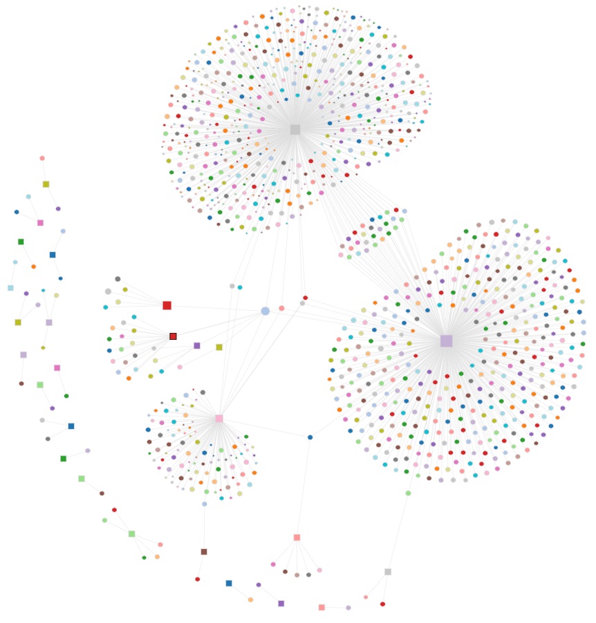
Simply Outstanding Work. http://au.politicaldonations.info Australian donations to political parties visualised. Look closely at the starting state of the visualisation. Do they look like lungs to you? Of course, the phrase "tip-of-the-iceberg" comes to mind. The Political Donations visualisation website takes publically available data from the AEC and presents it in a graphical view to make visual analysis of the donations…
World Atlas of Language Structures... Another in my mini-series of exceptional visual story-telling.. Another winner in the Information is Beautiful Awards for 2014 Links PuffPuff Project
The UK's National Air Traffic Services offers an animated tour of just how flight paths are managed. A fascinating and beautiful visualisation. Links Nats24
There are more than 1,200 active satellites orbiting earth right now, taking pictures, relaying communications, broadcasting locations, spying on you, and even housing humans. A database compiled by the Union of Concerned Scientists allowed David Yanofsky and Tim Fernholz to produce a stunning visualisation. Links Every Satellite - qr.com Union of Concerned Scientists Satellite Database
Did you know Melbourne Cup Winners are getting older over time? Just for fun... Learn About Tableau
Mapdwell's web-based Solar System platform helps users design at-home solar energy systems: it visualizes the costs and benefits of installing a solar roof by layering information about tax credits and carbon emissions savings onto a topographical map of local roofs, and helps determine the most efficient spots for panels. Links Mapdwell