The Information is Beautiful Awards for 2015, sponsored by Kantar really do highlight the exceptional [and beautiful] work available. Looks like I am not a bad judge either! Links Information is Beautiful 2015 Kantar
Category Archives Maps & Data Visualisation

This 3D Map Visualizes the U.S. Economy in a New Way The team at howmuch.net built a map to provide a 3D visualization of the GDP growth by US metropolitan areas. The higher the cone rising out of the map, the greater the GDP growth in that area. GDP growth increased 2.3% in 2014 as compared with 1.9% growth in 2013. The industry with…
Katie Park, the graphics editor at The Washington Post recently published an elegant data visualisation of the impact of the Californian drought on water storage levels. California is in the fourth year of its most severe drought on record, facing low precipitation, dwindling mountain snowpack levels and the hottest temperatures in state history. The water supply in the state’s reservoirs has…
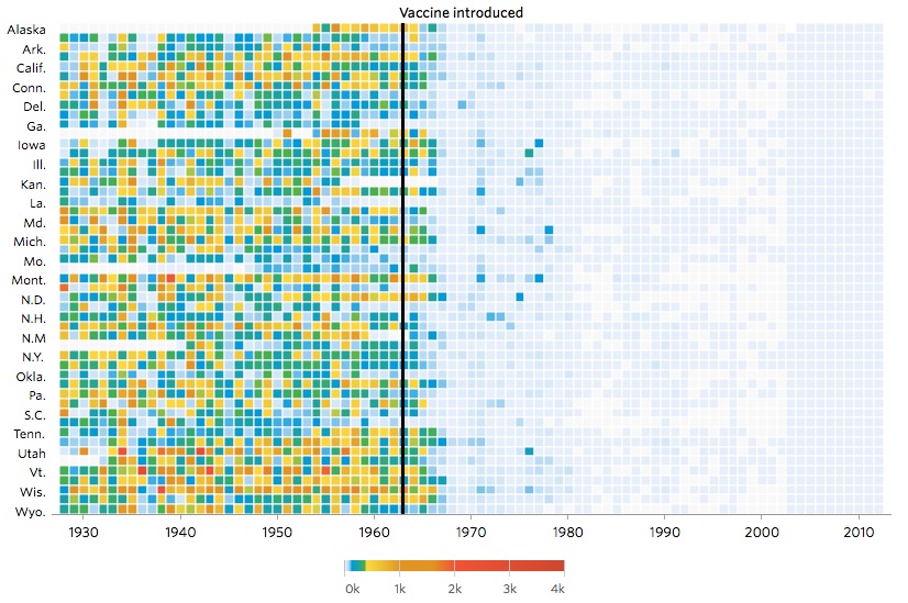
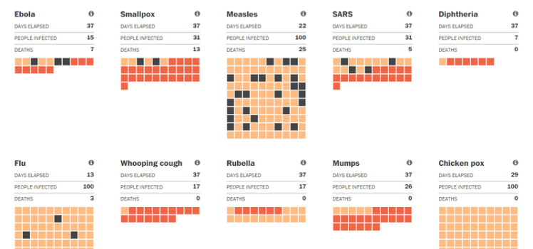
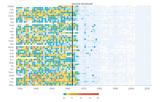
Project Tycho® is a project at the University of Pittsburgh to advance the availability and use of public health data for science and policy making. Currently, the Project Tycho® database includes data from all weekly notifiable disease reports for the United States dating back to 1888. These data are freely available to anybody interested. Additional U.S. and international data will…
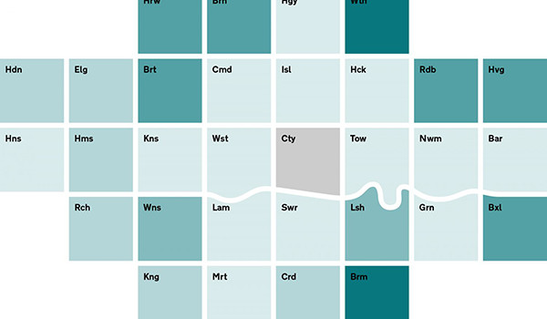
Victoria changes... @DELWP_Vic #demography https://t.co/cicAJkWv0N pic.twitter.com/dLRwdlWnQP — WhaleSongServices (@WhaleSongAus) November 13, 2015
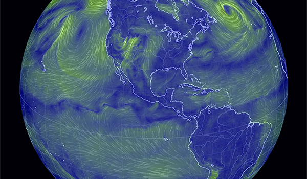
The Middle... Once again, Hans Rosling, Professor of International Health at Karolinska Institute and co-founder and chairman of the Gapminder Foundation, reminding us [ with data] just how much development has occurred across the globe in just 200 years. https://youtu.be/_JhD37gSNVU Links BBC2 - This world, Don't Panic - How to End Poverty in 15 Years. GapMinder Global Health 2007…

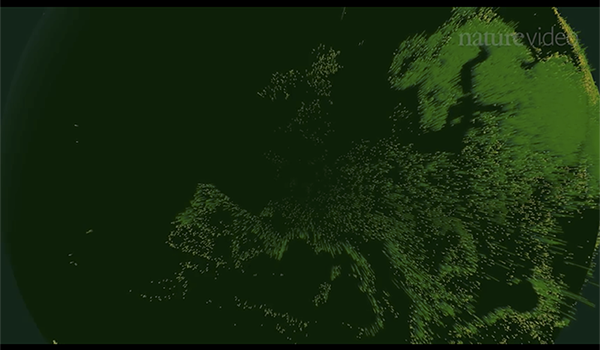
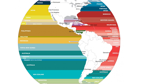
Europe is experiencing the biggest refugee crisis since World War II. Based on data from the United Nations, the LUCIFY group clarify the scale of the crisis with a stunning piece of visualisation. Links: The flow towards Europe - Lucify Refugee Council of Australia Asylum Seekers and Refugee Guide - Australian Human Rights Commission
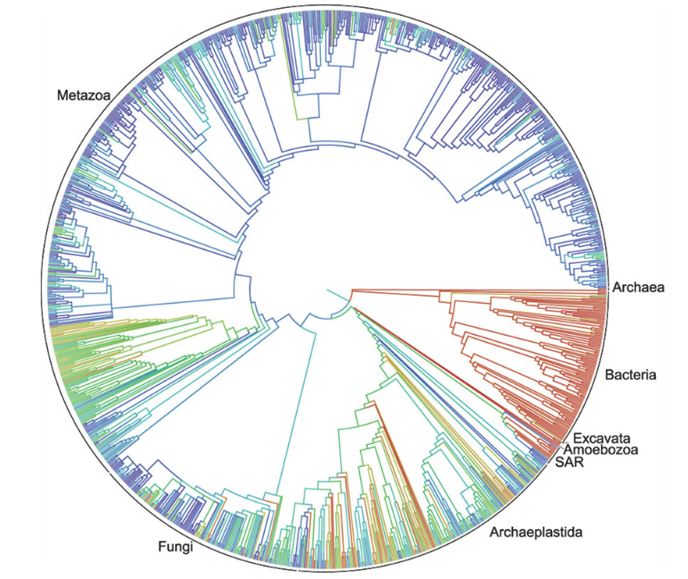
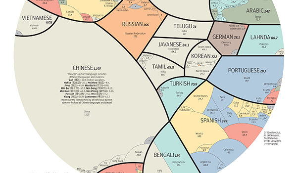
Duke University [in the US] has announced that a first draft of the “tree of life” for the roughly 2.3 million named species of animals, plants, fungi and microbes -- from platypuses to puffballs -- has been released. A collaborative effort among eleven institutions, the tree depicts the relationships among living things as they diverged from one another over time,…
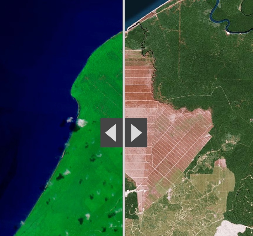
Its not a long time, twenty-five years. ESRI [ @Esri ] has produced some excellent comparative analyses of Human activities that are reshaping the Earth's surface using 1990 Landsat imagery [left] and Esri’s World Imagery basemap [right] Links LandSat Comparison - Story Map ESRI Story Maps LandSat