Let’s be clear – the childhood you remember no longer exists
Outstanding work by the ABC team abcnews , storylab, the Monash Climate Change Communication Research Hub and the ARC Centre of Excellence for Climate Extremes to visualise climate change over time and make the global, very personal.
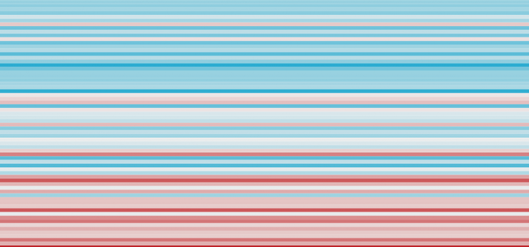
From top to bottom, these stripes use Bureau of Meteorology data to show how temperatures have changed in Australia since 1910. The colours indicate how much the average temperature of each year is above or below the average temperature from 1961 to 1990.
A blue line means that year was below average; red means it was above average. As you can see there is a pretty clear trend happening — from cool to warm — over the past century. Over this time the world has warmed 0.81 degrees Celsius, and Australia has warmed even more, hitting 1.14 degrees last year.
See how #climatechange has impacted the world since your childhood https://t.co/1PZbTMVB5k via @abcnews
— Bill (@billcoppinger) January 1, 2020
Consider this…
Please remind me again what the argument is against logic, reason or a more stable, predictable climate?
The research has been made with the assistance of the Monash Climate Change Communication Research Hub and the ARC Centre of Excellence for Climate Extremes.
Links
- How has climate changed since you were born?
- Carbon Brief.org
- 412.5
- Five from Five
- 1.5 – Probably Not…
- IPCC Global Warming of 1.5c
- 8th of October
- Oh, yeah, There’s this…
- Zero Carbon – The Future Called…
- The Fork in the Road
- Shutdown
- Carbon Conversations
- 410.05
- Mitigation, adaption… and suffering | Is there a choice?
- Water water everywhere and… nope.
- Yes, warmer still…
- 1.5 or 2 ? Take your pick!
- Consilience
- Elegy for the Arctic
- Cape Grim
- Flying Blind
- Hot, Hotter, Hottest… again
- Yes, the axis…
- What’s an Epoch? You’re standing in it!

[…] Let’s be clear, the childhood you remember no longer exists. […]