Data – Nothing to see here!
Ravi Parikh, in his HEAP weblog, offers some advice on “How to Lie with Data Visualization”
The importance of “data-literacy” and the cautious, if not skeptical mind, cannot be over-stated in a world of 24 x7 news cycles. .
Parikh offers a number of telling examples of the mis-use or abuse of data visualisation to distort or deliberately add bias to a particular data “narrative”.
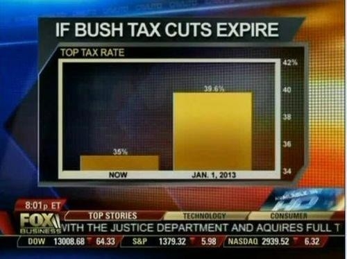
The significance of truncated Y-Axis caught my eye.
A real-world example whereby the “visual message” distorts that “numerical” or “actual” data message.
This Fox-Business graphic shows a distorted difference between the variables because the graph Y-Axis does not start at Zero…